Link to Music Video:
https://www.youtube.com/watch?v=7VDgTievgvU&nohtml5=False
Link to Evaluation Questions:
https://vimeo.com/160755928
Tuesday, 15 March 2016
Sunday, 13 March 2016


Tuesday, 8 March 2016
Music Video!
Here is the link to our final music video project. Watch in HD.
https://www.youtube.com/watch?v=7VDgTievgvU
https://www.youtube.com/watch?v=7VDgTievgvU
Thursday, 3 March 2016
Practice work: Cloning
I edited this video using a very basic crop method. I placed the tripod, and stood in two ends of the frame, and overlapped the video clips.
https://www.facebook.com/Sanya.Shahzad01/videos/421929931348846/
https://www.facebook.com/Sanya.Shahzad01/videos/421929931348846/
Practice Work: Music Video Test
Our media teacher gave us an assignment to take any song and clips from any movie, and compile it in a way, that it looks like a music video. And this is what I came up with. I used the song ' I See The Light' from the movie Tangled. And I used clips from Cinderella (2015)
https://vimeo.com/157637496
https://vimeo.com/157637496
Tuesday, 1 March 2016
Comments and Reviews
After we posted our music video online for our audience to view, we got a lot of feedback from them. Our targeted audience was the youth, i.e teenagers and early twenties. The feedback we received was mostly positive and people were able to decode the encoded message properly. These are screenshots of some of the comments under the actual video.


Monday, 15 February 2016
Promotion and Advertisment
Before we were going to release our music video for the audience to see, we made a basic poster and shared that on social media. We chose a picture where our actor has a gun against his chin. The reason as to why we chose this picture is because it's a very dramatic shot and creates a sense of excitement and mystery as to what's going to happen next. With that, we added the text on to the picture saying 'Music Video Coming Soon'.


Wednesday, 10 February 2016
Ancillary Task: Digipak (final)
This is what our final Digipak looks like.

EDIT:
After we presented this to our teacher, he pointed out a few mistakes. He advised us to remove the names of the actors and team members and add something else instead. So we decided to add the duration, artist name and song title. Since it looked a bit empty, we decided to add the rights reserved text on it too. But that was over lapping the barcode, so we decided to place it on the bottom left corner as we had some space there too.

This is what our final digipak looks like now.

Monday, 8 February 2016
Ancillary Task: Digipak
As we started working on our digipak, we kept in mind the theme our whole project had, But decided to keep it slightly appealing by keeping it in colour. In our music video we had several representative items. So to make it interesting, we decided to keep those.
This is the template we used.


We then proceeded to apply the edited picture file onto the template. For that we, again, used Adobe Photoshop CS6. To apply this picture, we went into edit, then paste special, and then paste. As the template was in a CD shape, we had to cut out the centre circular region. We did that by selected the Rectangle tool, and then Elliptical Marquee Tool. With this tool, we selected the inner circle, and removed it. This is how it looked so far.

Then we chose the front outside picture, and adjusted it's brightness and contract, and left the colours as they were. After, we added the edited picture onto the template and adjusted it according to how we wanted it to show. Then we simply added the text 'La Lune', which is the name of the song we used, and placed it on top of the cover. We didn't add the artist's name, as I believe, it creates a sense of branding, as if the name is required to be written down because his picture is enough. We took the inspiration from Lana Del Rey's 'Born To Die' album cover.


We moved onto the back outside of the digipak. The first two pictures were just pictures of the artist. So we decided to show a bit of what his product looks like. For that, we overlapped two images onto of each other and decreased their opacities. The two images we used were, one, of the female actor, who represented happiness, hope, and positivity in a figurative form. And two, the windchime, which we used as a symbol of her (hope) presence.


Moving onto the inside left of the digipak, we chose a still from the video itself from when the actor overcomes his depression and irrational cognitions. We edited it's colours in Adobe Photoshop CS6 using Colour Balance. Later, after we adjusted the picture onto the template, we added a verticle text along the right edge, saying All rights reserved to blueiceproductions. This is a very conventional item used in a digipak.


We decided to add a barcode on the outside left of the cover, and add a DVD video logo on top of the CD. These are a few more conventionally used items.The reason why we decided to place it on top of the CD is because we wanted the challenge the convention of placing it at the bottom. Also because the image we chose had negative space on the top, so it looked very vacant without anything.

This is the template we used.

We started by selecting a picture of our artist that we all agreed on to be on the inside right. We imported the picture into our photo editing software. For this we used Adobe Photoshop CS6. We turned it Black and White, and further decreased the amounts of the colours Red, Green, and Yellow, so that our picture gets a richer look.


Then we chose the front outside picture, and adjusted it's brightness and contract, and left the colours as they were. After, we added the edited picture onto the template and adjusted it according to how we wanted it to show. Then we simply added the text 'La Lune', which is the name of the song we used, and placed it on top of the cover. We didn't add the artist's name, as I believe, it creates a sense of branding, as if the name is required to be written down because his picture is enough. We took the inspiration from Lana Del Rey's 'Born To Die' album cover.


We moved onto the back outside of the digipak. The first two pictures were just pictures of the artist. So we decided to show a bit of what his product looks like. For that, we overlapped two images onto of each other and decreased their opacities. The two images we used were, one, of the female actor, who represented happiness, hope, and positivity in a figurative form. And two, the windchime, which we used as a symbol of her (hope) presence.

We added on the text of team members and actors after we adjusted the edited image onto the template.

Moving onto the inside left of the digipak, we chose a still from the video itself from when the actor overcomes his depression and irrational cognitions. We edited it's colours in Adobe Photoshop CS6 using Colour Balance. Later, after we adjusted the picture onto the template, we added a verticle text along the right edge, saying All rights reserved to blueiceproductions. This is a very conventional item used in a digipak.


We decided to add a barcode on the outside left of the cover, and add a DVD video logo on top of the CD. These are a few more conventionally used items.The reason why we decided to place it on top of the CD is because we wanted the challenge the convention of placing it at the bottom. Also because the image we chose had negative space on the top, so it looked very vacant without anything.

Saturday, 6 February 2016
Ancillary Task: Website (Final)
Here is the link to our website:
Edit:
We got our teacher to review our website and he wasn't satisfied. He suggested we add more content on it and have our music video on top of the screen so it's more easily visible to the viewer and won't have to search for the video. So we decided to alter it.

After that, we decided to add a tab on the top titled 'About'. In that we placed a basic bio of the artist as to where he's from and what music he makes.

So we needed a proper place for our video to be presented, hence we created a 'Music' tab and placed the video on the top of it and a large size. We also decided to enable the option of auto play so that people won't have to play it themselves.

Along with that, we added a Gallery to make our website more interesting and more appealing. It also helps us to promote our artist and his work much more. If you notice, we added a little pattern in the gallery as to how the pictures are placed. This made it seem more interesting and attractive to the eye.

For our tour tab, we added locations, dates, and short descriptions of upcoming events and meet and greets for our artist. It's for the artist's fans and followers to keep track of the upcoming activities.

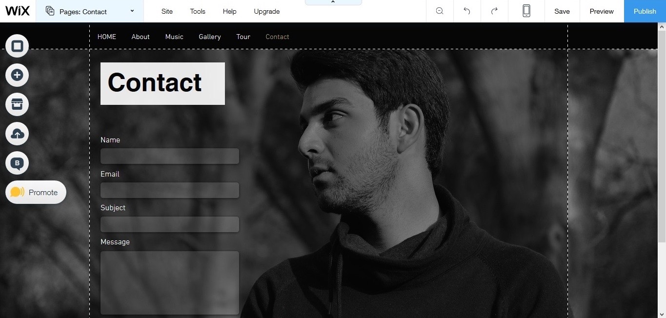
And finally, the last tab we added is 'Contact'. The main purpose for this is for fans and followers to have some interaction, and also so we can get consumer feedback. Along with that, we also added a social bar with all the social networking logos that redirect the consumer to the selected link. We added a subject section in the website to distinguish between the different types of mails, i.e Fan mail or official bookings. With this, we concluded our website.
Thursday, 4 February 2016
Ancillary Task: Website
In order to make our artist's website, we had to create a separate gmail account for our production team.

Once we made our email, we went on and chose a template which seemed to relate the most with our media product and seemed most appealing, amongst many choices.


This is the website template we chose for our artist's promotional website. It had a calm feel to it, and was themed black and gold, which matched most with our music video as it was shot in monochrome.


Here is how we edited the background picture for the website. We used Adobe Photoshop CS6 for this task, we adjusted the black and white's intensity, by reduced the red, yellow, and green's. This allows the image to give a richer look.

And this is what our final website looks like.

Wednesday, 3 February 2016
Website Research
Before we went ahead and made our website, we decided to do a bit of research on the different kinds of websites and what they should include. These are some of the websites' layout that we personally liked, and tried to incorporate parts of each into our website.


Sunday, 10 January 2016
Post Production: Compiling and Editing
So, to edit this video, we used the software Adobe Premiere CS6. We started by importing all of the footage we took into the project, and then cropped the clips we needed and added them into the timeline. we did colour correction by connecting our laptop (Macbook Pro) to a TV screen to get proper colours. For that we used RGB curves. We also cropped our video from the top and bottom to give it a cinematic look. Also, all the shots were slowed down by using the Rate Stretch Tool. Along with that, a lot of the editing took place in Adobe After Effects CS6, which included masking. We applied the mask on the female actor, as she was supposed to be shown in colour, while the rest of the video remained monochrome. We animated the masks for each frame and feathered it out to avoid harsh edges.
Some of our handheld shots were too shaky, making our video look unprofessional, so to fix that, we used Warp Stabiliser to smoothen out the shaky movements.


Some of our handheld shots were too shaky, making our video look unprofessional, so to fix that, we used Warp Stabiliser to smoothen out the shaky movements.


Subscribe to:
Posts (Atom)